Last week’s blog about how to interior design a living room you learned how to measure your room, and plan your furniture layout. Armed with this powerful information, you’re almost ready to go shopping for your furniture and accessories!
But there are a few more steps in the planning process on how to design a living room to make sure you are perfectly poised with ALL the information you need to never make those costly mistakes.
In Part II of my series, together we’ll map your style and your color palette.
WHAT’S MY STYLE?
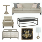
“Ok,” you say to yourself, “I have my space plan, now what?” We are going to do a little exercise to figure out your style. Look at these styles of sofas and make a quick choice – which one makes you think – “THAT’S THE ONE!”
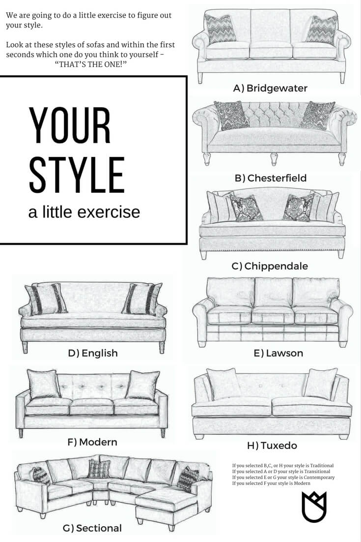
If you selected B,C, or H, your style is Traditional
If you selected A or D, your style is Transitional
If you selected E or G, your style is Contemporary
If you selected F, your style is Modern
TRADITIONAL is classic styling rooted in 18th-century English, 19th-century neoclassic, French country and British Colonial revival history. Spaces are generally symmetrical and orderly with a muted color palette rich in florals, solids, stripes or plaids. Ornamental, fine carved wood furniture, overstuffed sofas with tufting and skirted furniture are mixed with antiques. Sometimes the traditional style is quite feminine with lush rose patterns, extensive uses of greens, reds, pinks and blues. Generally furniture is ornate, fanciful and with decorative embellishments. Often, one color way of fabric with different patterns is repeated throughout the space. Antique and heirloom furniture with dramatic layered window treatments are common. Search for images of Ralph Lauren Home for inspiration.
TRANSITIONAL bridges contemporary and traditional design. It has a deeply rooted sense of history in some pieces, but furniture often gets an update with cleaner lines. Furniture pieces are short with ornately turned legs and feet; hardware is heavy and often burnished. Velvets, linens and textured fabrics are mixed with textured walls. Visit Crate & Barrel and Pottery Barn for transitional looks.
CONTEMPORARY is currently the most popular style by far with its clean, sleek lines and solid predominantly muted neutral colors. Bold pops of color in furniture and accessories accentuate a contemporary space. Furniture is sleek, lower to the ground and often has metal frames or straight legs with an emphasis on basic shapes and forms. Graphic elements in artwork or as accents work well with this look. Arts and Crafts style furnishings fit into this category. The focus is simple in form, without extraneous decoration, often showing the way pieces and materials were put together. Room & Board is a good source for contemporary design inspiration.
MODERN is always minimal with a true use of material and an absence of decoration. Furniture and architecture is sleek, boxy and streamlined. It’s characterized by a neutral color palette, polished surfaces, strong geometric shapes and asymmetry. Mid-Century Modern is a style that fits into this category. It is a look originating in the ‘50s and ‘60s (think Mad Men). Scandinavian designers and architects were very influential at this time, with a style characterized by simplicity, functionality and natural shapes. Pops of deep colors such as orange, yellow, olive green and chocolate brown add to decor. An updated version of this look is found at stores like Jonathan Adler, marked by fun, colorful and quirky furnishings.
TIP: It is a good idea to create interest by mixing styles, woods, colors, and patterns. Eclectic is the catch-all style that borrows from several other design styles and evokes a sense of artistry and amazement with unexpected contrasts. This doesn’t mean you can just throw together everything and anything, but rather rely on the building blocks of design – color, pattern, and texture and composition (remember – you already composed your space in the planning) to make the space look cohesive.
WHAT’S MY COLOR?
I can’t tell you your color, but I can give you a primer on color theory that will give you the ability to pick the right colors for your room. There are a gazillion books written about color theory and I devoted many hours to college classes on the subject. Here is a quick and dirty primer on color theory and how you can easily figure out your perfect color scheme.
HINT: Try stepping out of your comfort zone. It’s not that I hate beige, but there is SO MUCH MORE!!
Color impacts how we feel and how we behave (you know green makes you hungry and red doesn’t – that sort of thing), so color is a powerful tool for an interior designer when making the choices for a particular home.
Color also affects the perception of form, the dimensions and qualities of your room.
However, merely understanding the emotional qualities of color is not enough. An understanding of the history, science and theory of color is essential knowledge when you design your room. Understanding color in relation to interior design will make your design project so much easier. If you follow the basics of color theory when choosing your color palette you will be able to achieve the professional look you are striving for.
Color Theory Primer
Pull out that color wheel I asked you to purchase last week. The COLOR WHEEL organizes colors in a logical fashion based on the primary, secondary and tertiary hues. The primary hues are yellow, red and blue seating at twelve o’clock, four o’clock and eight o’clock. The secondary hues are a mixture of the primary colors and are orange, green and violet seating adjacent to the primary colors, followed by the tertiary hues of red-orange, yellow-orange, blue-green, blue-violet, and red-violet. The value of a hue can be altered by adding white, gray or black.
When white is added to a hue it is called a tint.
When gray is added to a hue it is called a tone.
When black is added to a hue is it called a shade.
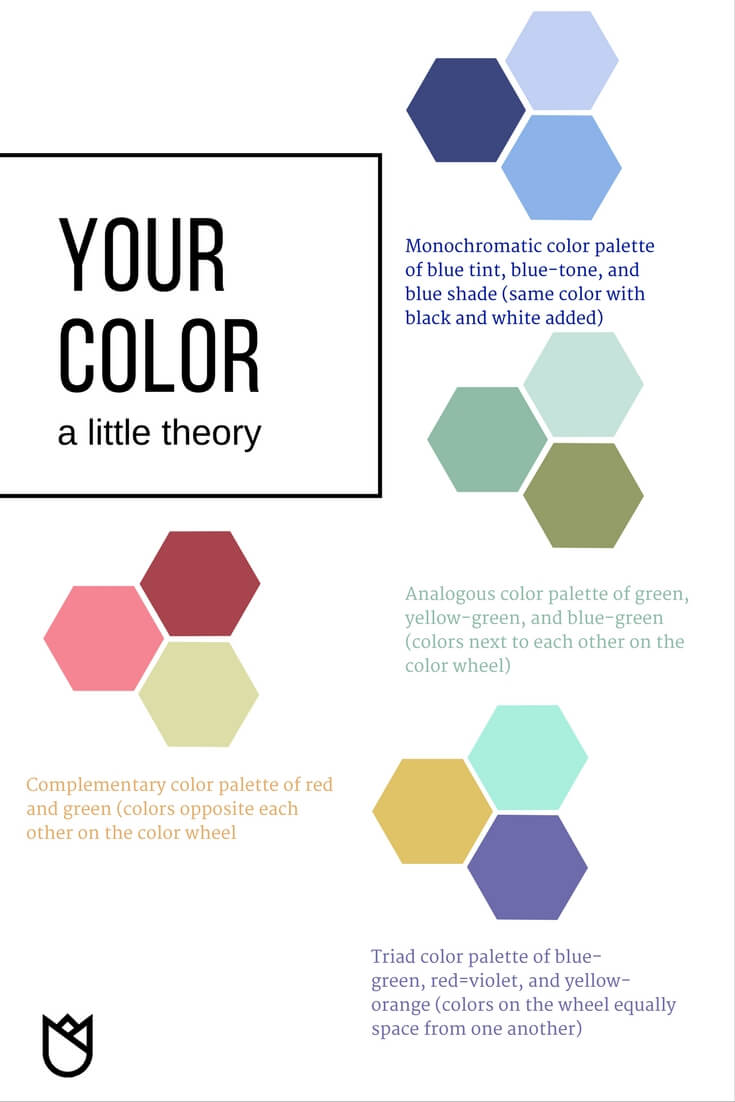
The outermost ring of this color wheel is the pure hues of the color wheel. The receding layers are the tint, tone, and shade of the respective colors.
The easiest ways to pick out your color palette is to find an inspiration. I had one client who had an heirloom vase belonging to her grandmother. It had sentimental value and how she picked her color palette of amber, green, and blue (split-complimentary).
What about starting with textiles? Fabric or rugs are a great place to start when selecting your color palette. (read this blog to learn more)
Artwork is one of my favorite inspirations and if you have a special piece letting the artwork guide you is a good way to pick your color palette.
There is one rule of thumb – YOU CAN ONLY PICK THREE COLORS AND YOU MUST STICK TO THOSE THREE COLORS.
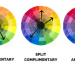
So let’s play with your color wheel. It has a little dial with arrows, turn the dial around and it will show you which colors go together opposite each other. This is a complementary color scheme and makes any room look the best.
But you can also pick colors next to each other on the color wheel for a more monochrome color palette. Compare it your inspiration piece to find the colors you want to land on.
I said I wasn’t going to tell you your colors – but read this blog for our favorite wall and trim colors that will go perfectly with just about any décor
Next week we will talk about your finishes and lighting.
Feeling a little overwhelmed, but you still think you can’t afford an interior designer? I have the perfect solution for your situation! It’s our eDesign packages. These are perfect for virtual design, where you get to lean on my expertise, but still save a ton of money by DIYing most of the work. Read more here about our eDesign packages


Right Angle Developers
| 1 April 2024Invaluable advice! Part II brilliantly guides us through the interior designing a living room. Appreciate the detailed insights. Thank you for sharing!
Kathleen Jennison
| 25 July 2024Thank you for your kind words about our design advice, we’re thrilled to hear that Part II was just as helpful for you. We take great pride in providing detailed insights and guidance for our clients, and we are glad that it has proven to be invaluable for you. Thank you for choosing KTJ Design Co and for taking the time to leave us a review. We appreciate your support and hope to continue sharing our knowledge with you in the future. Have a wonderful day!
Vivid kreations
| 12 August 2025This blog is fantastic beautifully guides you from layout planning to defining your style and palette, making living room design feel both grounded and inspiring. Well done!
Kathleen Jennison
| 28 August 2025Thank you so much, Shree! I really appreciate your kind words. Living rooms carry so much of a home’s personality, so I wanted the blog to feel both practical and inspiring. I’m glad the step-by-step approach resonated with you. Always fun to connect with a fellow creative at Vivid Creations—cheers to more beautifully designed spaces!