When a bathroom doesn’t work, you know it. Every morning routine feels like an obstacle course. Bumping elbows at the sink, nowhere to put towels, and no logical flow between the shower, vanity, and storage. These are the small frustrations that add up fast, especially in older homes where space is limited and layouts were designed for another era entirely.
At KTJ Design Co., we love solving these puzzles. While every client comes to us dreaming of beautiful tile and shiny new fixtures, the real magic starts with the floor plan. Once the space functions properly, everything else from the finishes to the lighting, falls effortlessly into place.
Here’s a look at three bathrooms that started out small, dated, and dysfunctional and how smart space planning completely transformed them.
Rosewood Way: Turning Wasted Space into Everyday Luxury
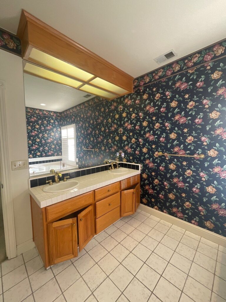
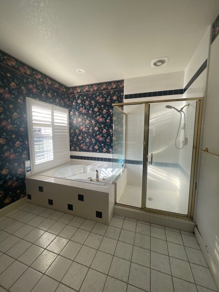
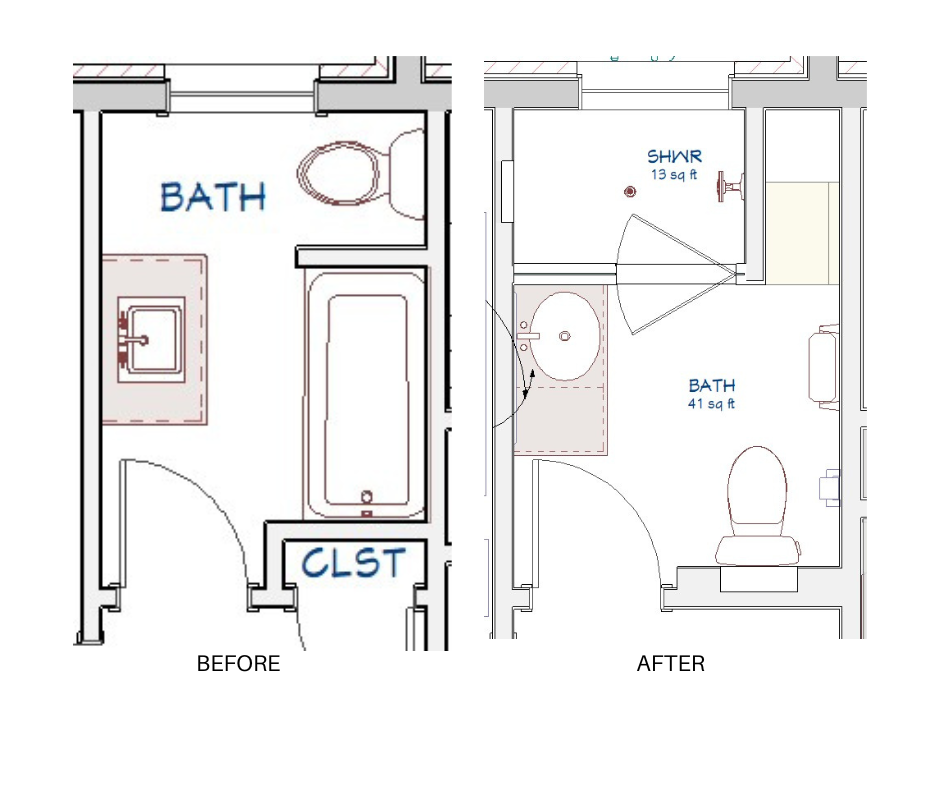
When our clients on Rosewood Way first reached out, they were living with a 1990s time capsule; floral wallpaper, square tile countertops, and a soaking tub the size of a small boat. Built in 1994, the bathroom was showing its age in more ways than one. The tub sat unused, the tiny shower had started leaking, and the two separate vanities offered barely enough storage for a toothbrush. Functionally and visually, it just didn’t work.
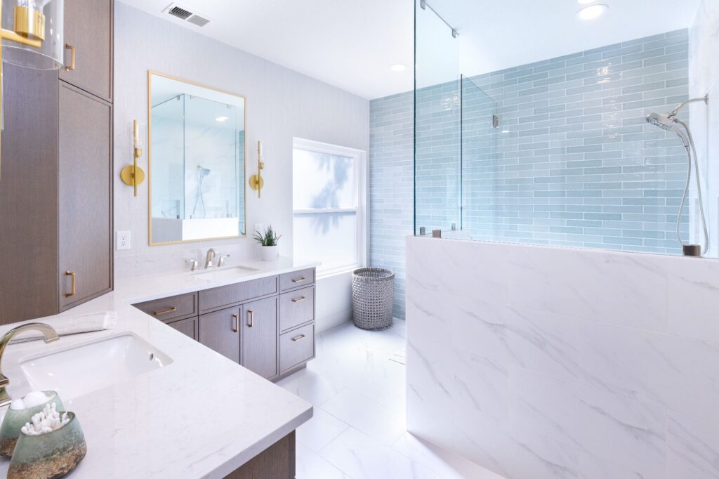
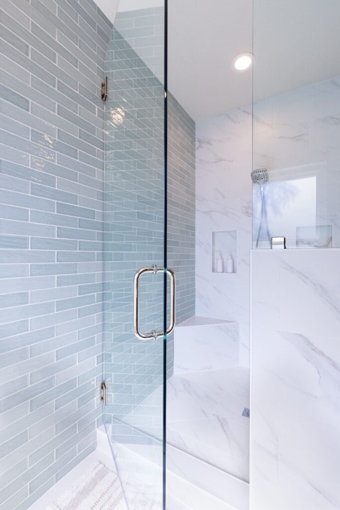
Our first step was to rethink the entire footprint. The oversized tub was removed, and we expanded the shower to create a true walk-in experience complete with built-in niches, a bench, and a glass enclosure that makes the room feel open and airy. We then reshaped the vanities into an L-configuration that wraps around two walls, allowing for better flow, more counter space, and (finally) ample storage.
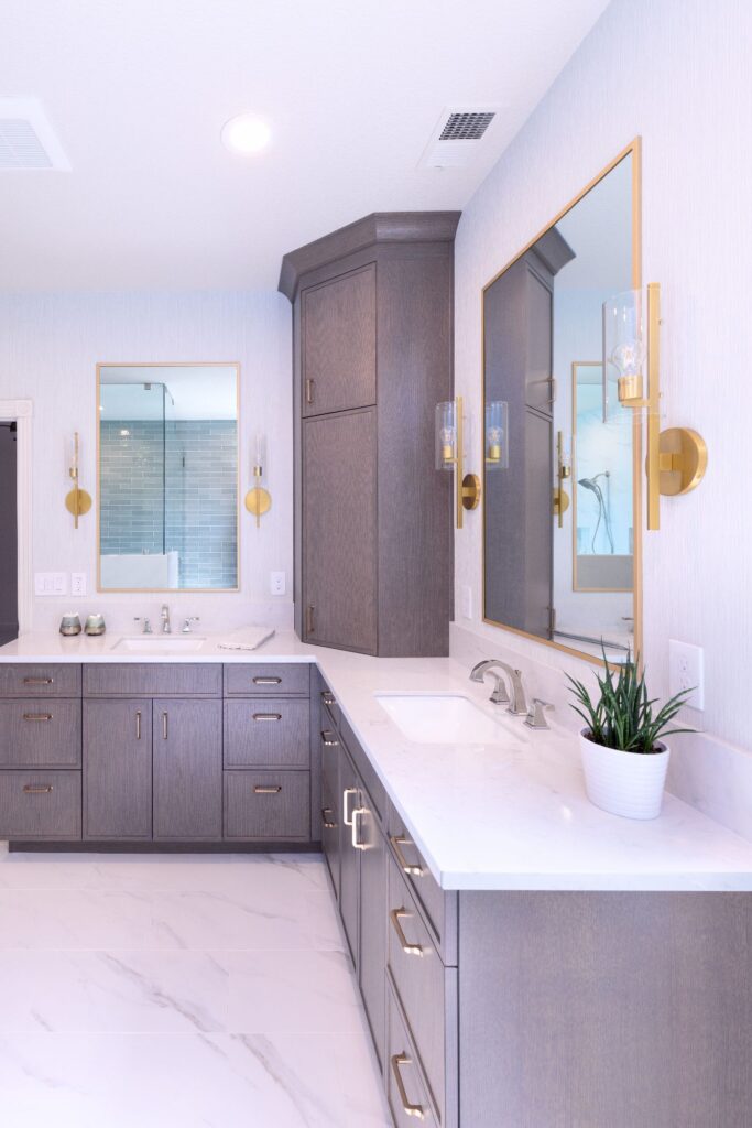
To balance the new layout, we placed a tall linen cabinet at the corner where the two vanities meet. It serves as both a design anchor and practical storage for towels and toiletries. A marble countertop spans both vanities, giving the room a cohesive surface that’s easy to maintain.
The design concept aimed for calm sophistication. Warm wood cabinetry pairs beautifully with the soft green tile in the shower, while large-format marble-look tile on the floor elongates the space and minimizes grout lines. Subtle wallpaper around the vanities and window adds texture without overwhelming the room. Brass accents and wall sconces bring warmth, and twin round mirrors complete the refined, modern look.
The transformation turned what was once an awkward, outdated bathroom into a spacious, functional retreat. With smart space planning and timeless details, this master bath now feels balanced, bright, and built for two.
Monterey Avenue: From Cramped and Dated to Bright and Brilliant
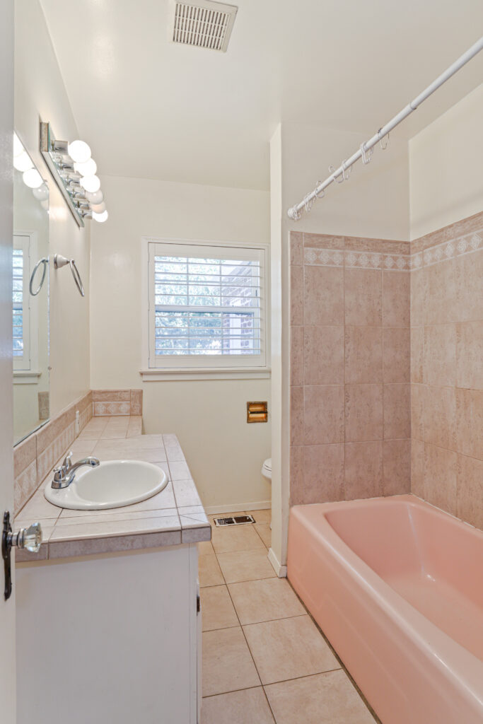
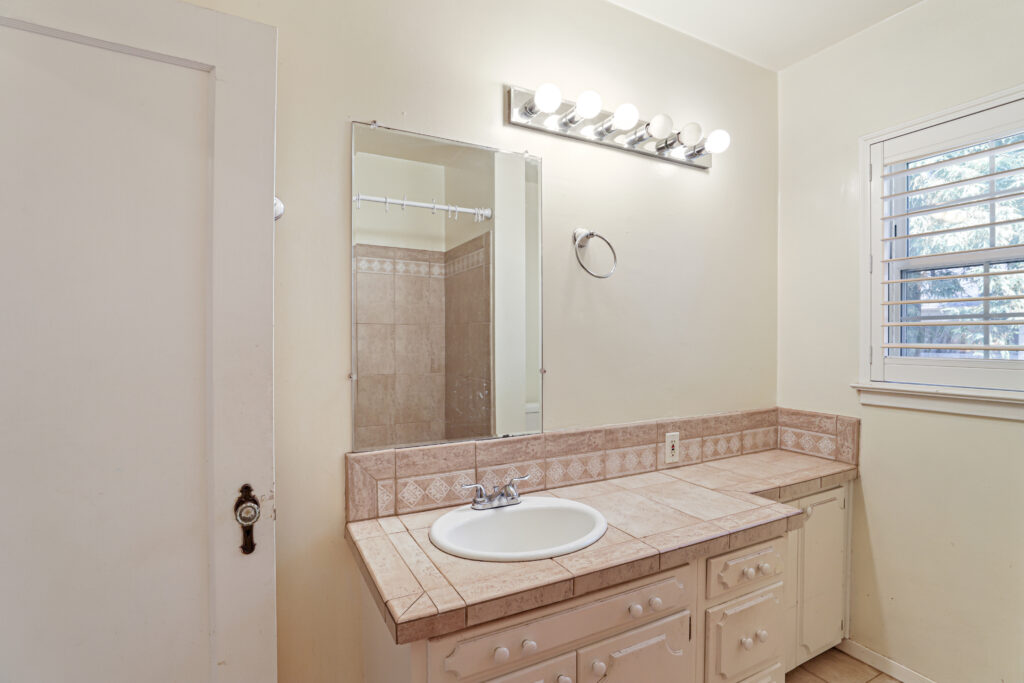
Built in 1938, this charming Tudor cottage had all the vintage character you’d hope for except in the bathroom. The small space was dominated by a massive pink cast-iron tub, a dividing wall that chopped up the floor plan, and a vanity so narrow it barely offered room to wash your hands. To make matters worse, the original layout left little space to move, and the hallway linen closet was the only storage nearby.
The goal was to transform this cramped, outdated bath into a space that felt light, modern, and functional while keeping the home’s historic charm intact. We started by removing the oversized tub and reclaiming every inch of wasted space. The toilet was relocated, and in its place we added a sleek washlet (a small luxury that makes a big impact). The shower was repositioned under the window, surrounded by a glass enclosure that now fills the entire room with sunlight.
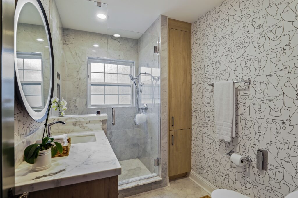
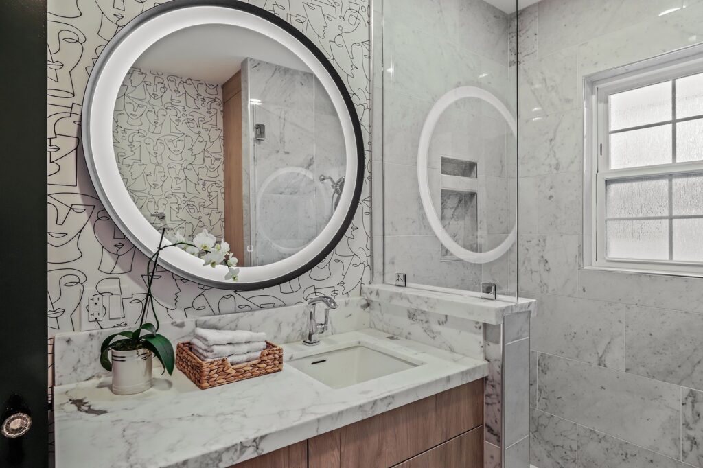
To make the footprint work harder, we borrowed space from the hallway closet to slightly enlarge the room and built a new linen cabinet beside the shower for towels and toiletries. A custom vanity with drawers maximizes storage while keeping the floor area open. The marble countertop adds polish, and the round lighted mirror brings both style and function.
The finishes tie everything together with quiet sophistication: marble hexagon tile on the floor and shower pan, large-format marble tile on the shower walls, and playful line-art wallpaper wrapping the entire room. Together, they create a look that’s timeless but far from traditional.
Now, what was once dark and crowded feels airy and spa-like. With added storage, improved flow, and a few modern amenities, this petite bathroom feels every bit as luxurious as a master suite.
(You can read more about this project in our earlier post, My Beautiful Renovation Property.)
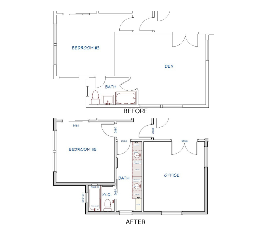
Country Club Boulevard: Twice the Function in the Same Footprint
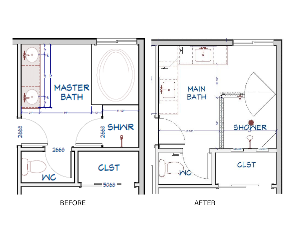
This petite 1952 bathroom was clearly an afterthought. Added sometime after the original construction, it was squeezed between two rooms and accessible only by walking through a bedroom or the family library. An awkward layout made worse by its size. Inside, a small tub-shower combo and pedestal sink left no room for storage or privacy, and for two teenage girls sharing the space, the morning routine was pure chaos.
To fix the flow, the space planning started by closing off both original entrances and reclaiming square footage from the adjacent library. That allowed us to create a new, direct hallway entrance and expand the bathroom by about four feet—just enough to make a huge difference in usability. We divided the new space into two functional zones: a private toilet and shower room behind a separate door, and a vanity area designed for simultaneous use.
The new double vanity spans nearly the entire wall, with each sink area mirrored and flanked by drawers and pullouts customized for hair tools, makeup, and toiletries. Between them, a lower makeup station provides the perfect shared workspace and gives the layout a built-in, furniture-like feel. At the far end, a tall utility cabinet conceals a laundry hamper and shelves for towels and supplies.
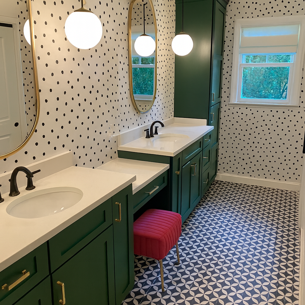
Daylight now streams in from a window at the end of the room, brightening the patterned floor and highlighting the soft green cabinetry which is a playful but timeless choice for a space shared by sisters. Brass accents and globe pendant lights complete the look, adding warmth and modern personality.
What was once a cramped, disjointed addition is now a smartly planned, cheerful bathroom that works beautifully for two. With defined zones and abundant storage, this remodel not only streamlined the morning routine but also restored peace (and privacy) to the household.
Why Smart Space Planning Always Comes First
When clients call us about a bathroom remodel, they often start by talking about finishes, you know the tile, lighting, and fixtures. We love those details too, but our first question is always about function. Does the layout work? Can the space flow better? Is there a way to gain efficiency without adding square footage?
Every one of these three bathrooms proves the same point: good design starts with good planning. It’s not about squeezing more in, it’s about making the space you already have work smarter. Our design team uses precise drafting, thoughtful layout studies, and a deep understanding of how people actually use their bathrooms to create spaces that feel intuitive and timeless.
We hear it all the time after that first design presentation: “I would’ve never thought of that.” That’s the best compliment we can get, and it’s exactly why our clients trust us to reimagine even their most challenging rooms.
If you’re ready to see what’s possible in your own bathroom, let’s start with a plan that makes every inch count.
Book a Discovery Call today and let’s talk about your project.
Until next time,