A Quick Beach Get-a-Way Inspires Color Palette
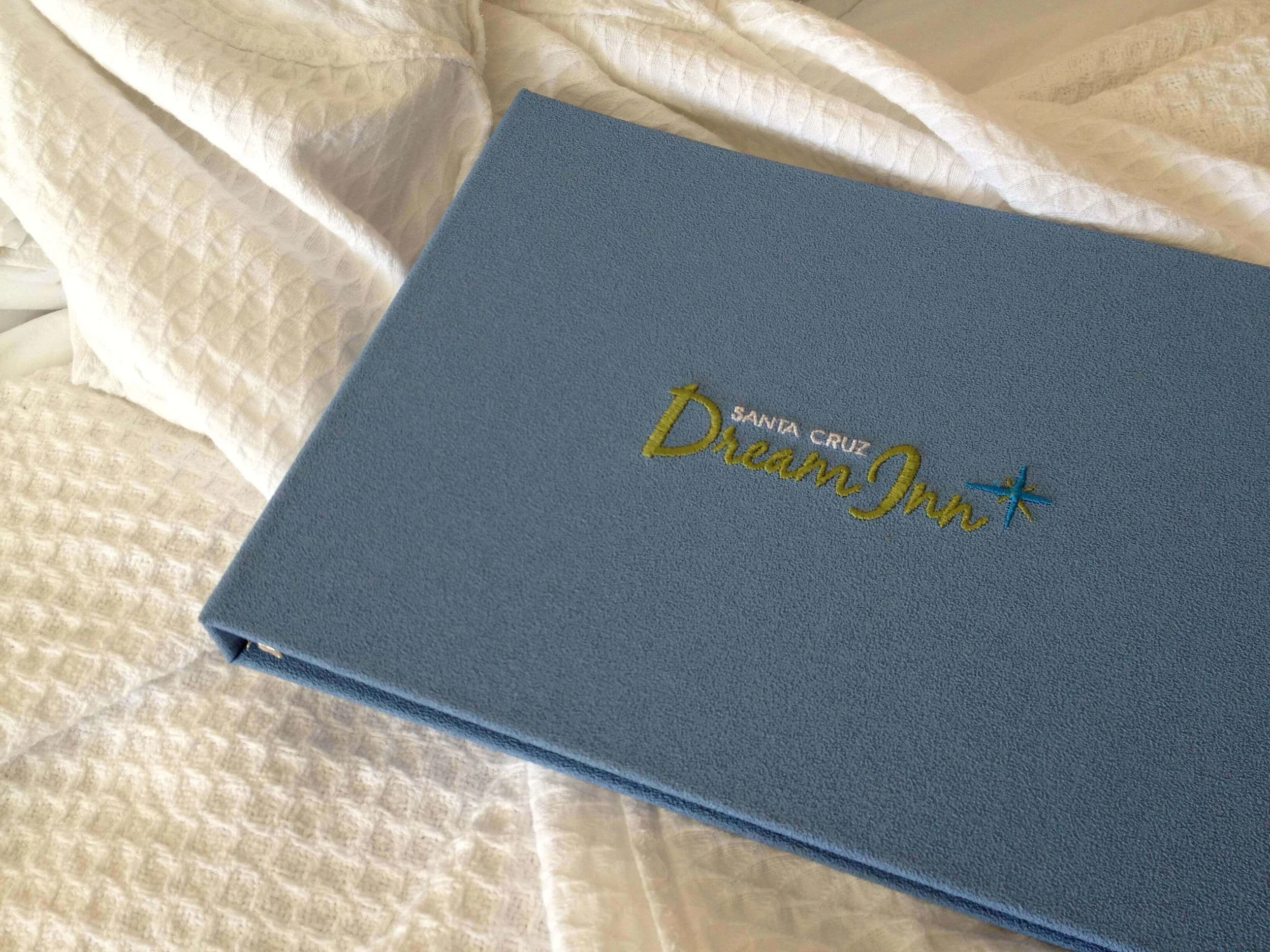
I went to Capitola, California this week to check on my client’s kitchen and bath remodel and we decided to stay the night in Santa Cruz. I’ve wanted to stay at The Dream Inn since it was acquired by Joire De Vivre and this was the perfect opportunity. I’ve stayed at several of their boutique hotels (Hotel Tomo in San Francisco is one of my favorites) and the décor is always streamline, purposeful and full of color. The Dream Inn did not disappoint with its retro-chic vibe and our room had a panoramic view of the ocean, sand, wharf and boardwalk.
Using Nature to Inspire
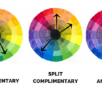
We get so many calls for color consultations and most of the clients are in agony over selecting a color. As I sat on our lovely balcony, I snapped several images with my iPhone. I thought, “these colors are a great inspiration for a color palette.” Picking interior design colors shouldn’t be torture and most times taking simple cues from nature is, well, natural. (Tweet This)
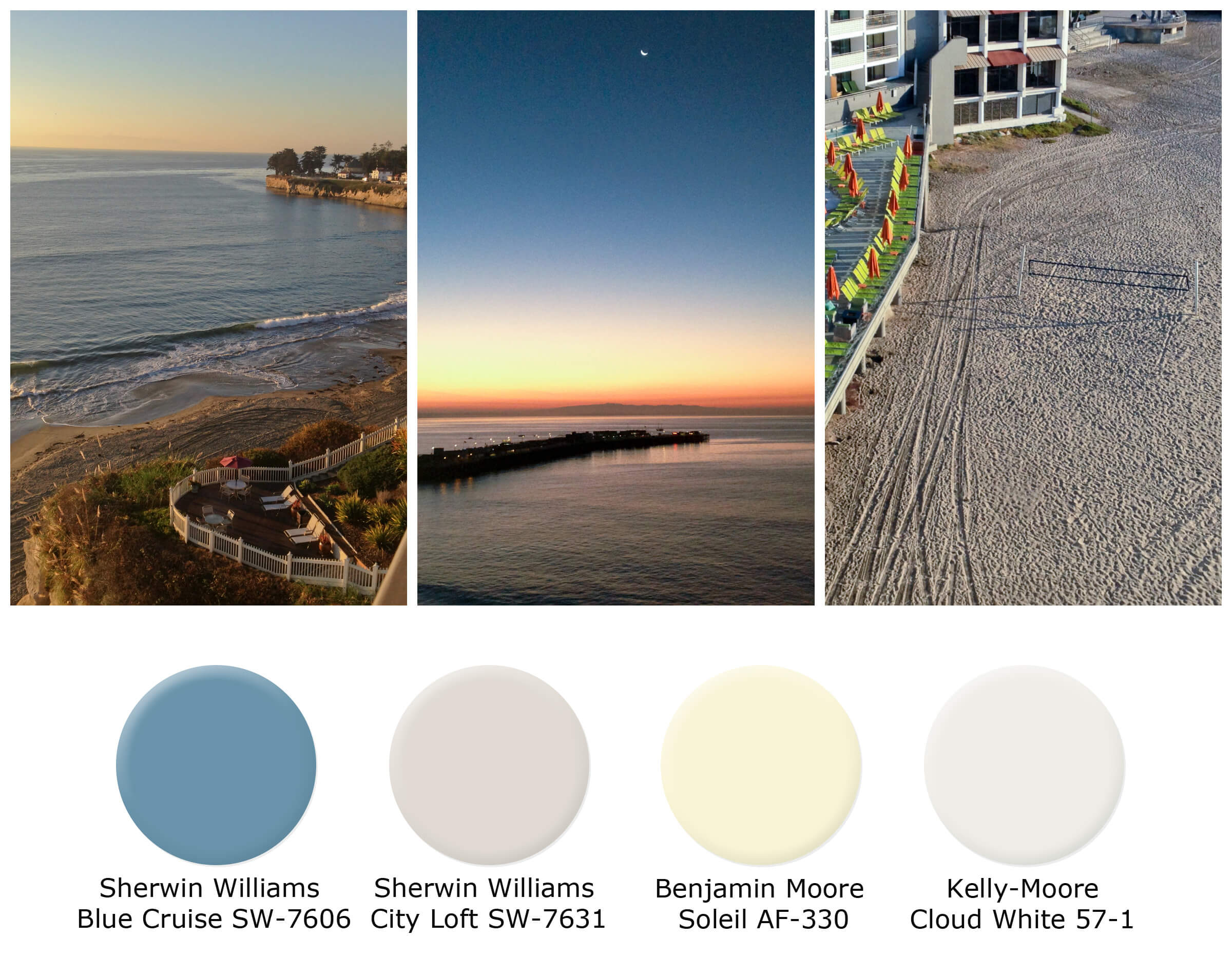
The blue sky as the sun rises along with the blue of the morning ocean is the perfect deep blue. The sand and cliff walls inspired me for the perfect neutral – Sherwin Williams City Loft. Yellow is one of my favorite colors, but it can be hard to incorporate into a color scheme, but the rising sun is just the right amount of yellow and Benjamin Moore’s aptly named Soleil was my choice for this palette. I think white in a room always provides a spark of brillance, you might not be able to see it too clearly in this picture, but the crescent moon and foam from the waves also inpired White Cloud from Kelly-Moore.
What inspires you? Have you been somewhere and thought “wow?”