how-to-spruce-up-kitchen-on-budget
How to Spruce Up Your Kitchen on a Budget
When we met with our new client for a Remodel Clarity Session, he wasn’t sure what to do with his kitchen – gut it, remove a wall, or what? Because he had many other areas of his home that needed attention, we suggested that he opt for a mini-makeover of his kitchen rather than a full remodel. (That’s right, you don’t always need to do a full remodel to get great design.)
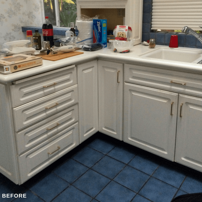
how-to-spruce-up-your-kitchen-on-a-budget-before 1
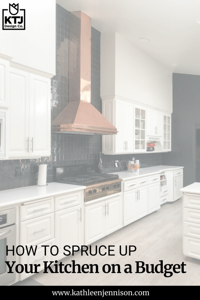
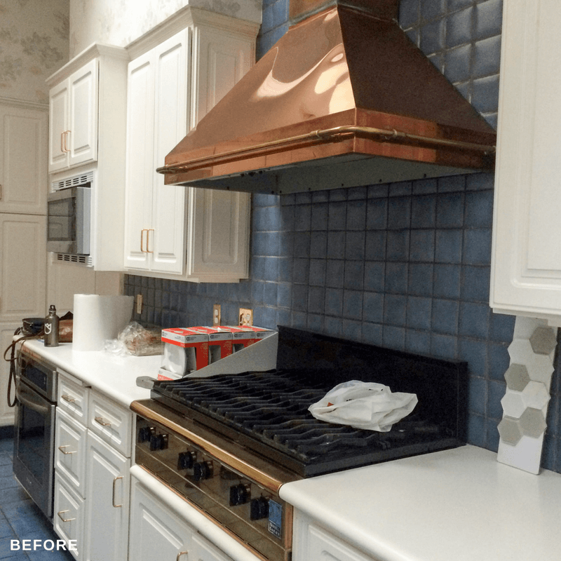
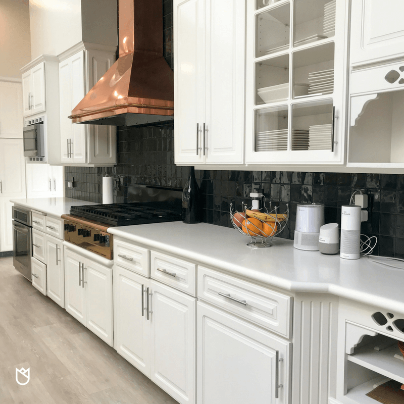
His kitchen already had a copper range hood and range from Italy that are just spectacular. The cabinets weren’t horrible, and the layout worked well. Best of all, the natural lighting from the skylights is phenomenal.
6 Ways to Spruce Up Your Kitchen on a Budget:
The first thing my eyes landed on was the magnificent copper and gold ventilation hood with a matching cooktop. There was no way I was letting my client demo these
#1 Backsplash
The first thing I noticed about this kitchen was not the unfortunate blue square tiles, the cheap gold pulls on the cabinets, the wallpaper, or the tired flooring. The first thing my eyes landed on was the magnificent copper and gold ventilation hood with a matching cooktop. (The brand name is Italian, and I couldn’t find any information on them. Sorry!) Aren’t they just spectacular? I couldn’t let the client remove these beauties.
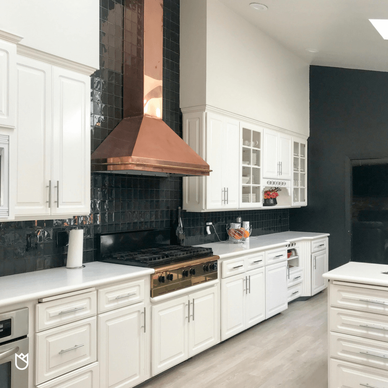
We opted to polish the copper and gold and accentuate it with a charcoal black dimensional glass rectangle tile with beveled borders and concave backs. The tile adds a sense of fascination and makes an already-perfect focal point (the hood) stand out even more.
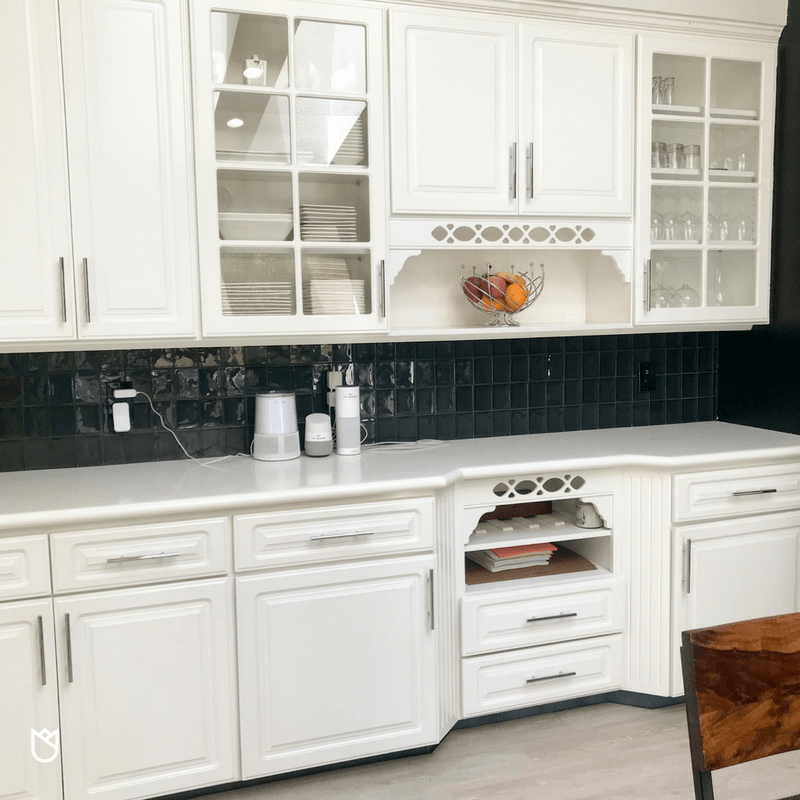
The 80s whimsical wallpaper had to go. We painted the walls our favorite Sherwin Williams White Duck and added a black accent wall to highlight the vaulted ceiling
#2 Wall Coverings
The 1980s whimsical wallpaper had to go. We painted the walls our favorite Sherwin Williams White Duck and added a black accent wall to highlight the vaulted ceiling and make the space feel more masculine for our bachelor client.
The cheap cabinet pulls were swapped out for sleek and modern stainless steel pulls. We were limited on our choices because we had to find a pull that was the same size as the old pulls
#3 Cabinet Pulls
The cheap cabinet pulls were swapped out for sleek and modern stainless steel pulls. We were limited on our choices because we had to find a pull that was the same size as the old pulls (because of the screw holes already drilled into the cabinets).
We added new luxury vinyl tiles to this client’s entire home. The light wood finish looks and feels almost like Hygge
#4 Flooring
We added new luxury vinyl tiles to this client’s entire home in Ivory Coast Oak. The light wood finish looks and feels almost like Hygge.
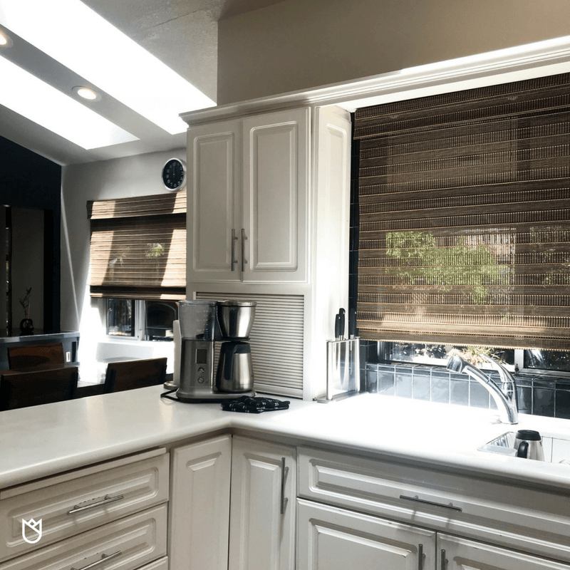
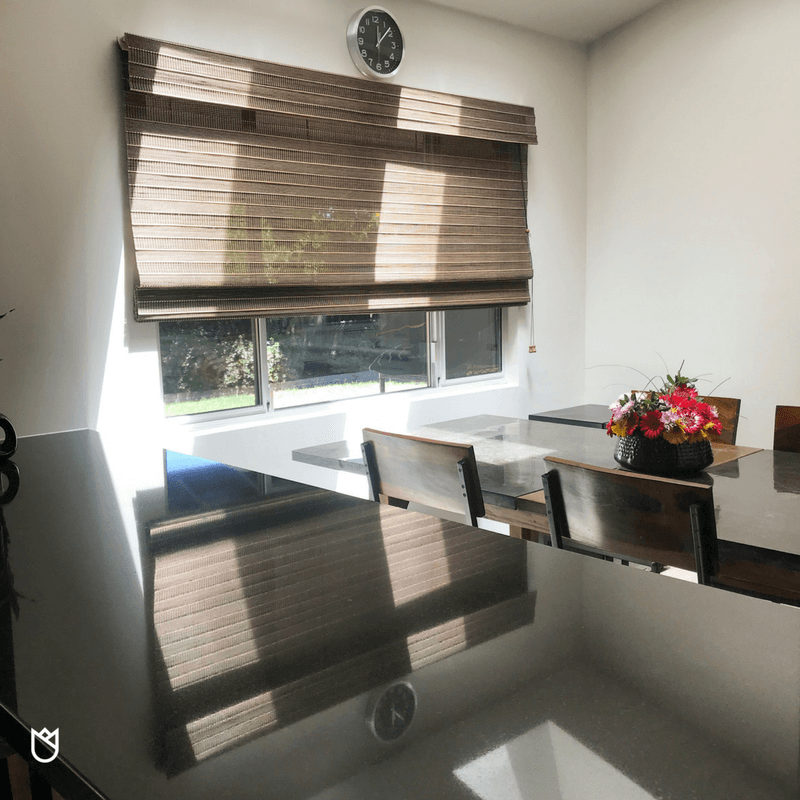
With so many sleek surfaces we needed a bit of texture. Boasting both texture and a natural wood element, woven wood Roman Shades are our favorite
#5 Window Coverings
With so many sleek surfaces (white cabinets, Corian countertops, copper, and stainless steel) we needed a bit of texture. Combining both texture and a natural wood element, woven wood Roman Shades fit the bill. The dark brown wood and black thread coordinated well with our chosen theme.
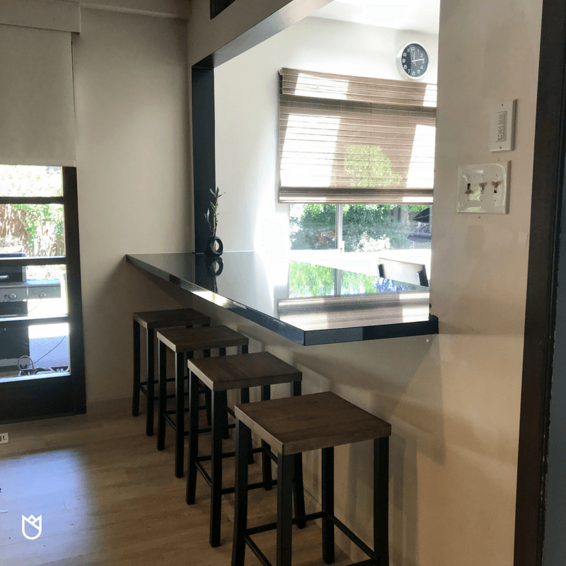
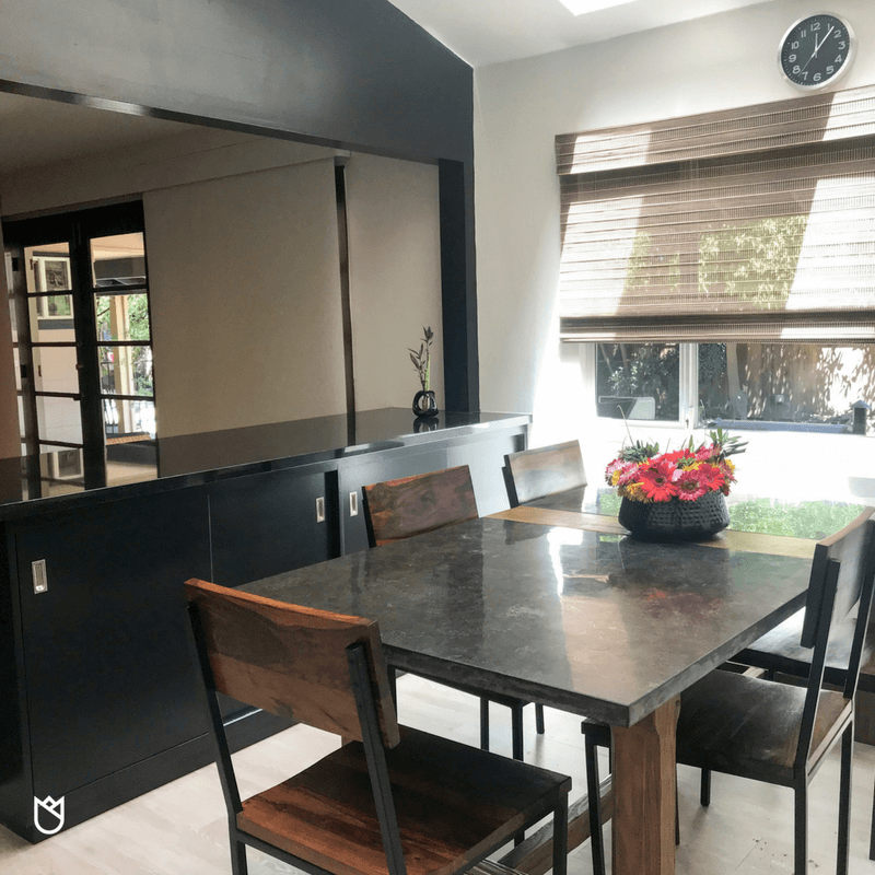
Because we didn’t remove a wall, we chose instead to create a bar seating area by making a pass-through to the great room. This was accomplished by cutting a hole in the wall
#6 A Bar Area
Because we didn’t remove a wall, we chose instead to create a bar seating area by making a pass-through to the great room. This was accomplished by cutting a hole in the wall, adding a black granite top (we got a remnant from our local fabricator so that we didn’t have to buy a whole slab) and building a narrow liquor cabinet on the kitchen side. This provides just enough extra seating for all the parties our client throws.
If you are contemplating a kitchen remodel and don’t know where to start…
Let the designers at KTJ Design Co. help you get clarity and direction for your kitchen remodel. We can develop a master plan to get the process started. Click here to read more about our Your Kitchen: A Love Story design package.

stockton-interior-designer
[gravityform id=”19″ title=”true” description=”true”]