Recently, I have been doing lots of color consultations. My swatch boxes from Sherwin Williams, Kelley Moore Paint, and Pratt & Lambert and been pilfered for sure. Understanding color in relation to interior design is, like shape and texture, an inherent visual property of all form. We are surrounded by color in our environmental settings and understanding the science and theory of color is an integral knowledge required for an interior designer. Color affects the perception of form and the dimensions and qualities of interior space. Color impacts how we feel and how we behave, so color is a powerful tool for an interior designer when making the choices for a particular environment.
Indeed, color is perceived differently by each individual and is affected by its discrete space and time. Seeing color or the knowledge that how each person sees color is an important concept for an interior designer to acknowledge.
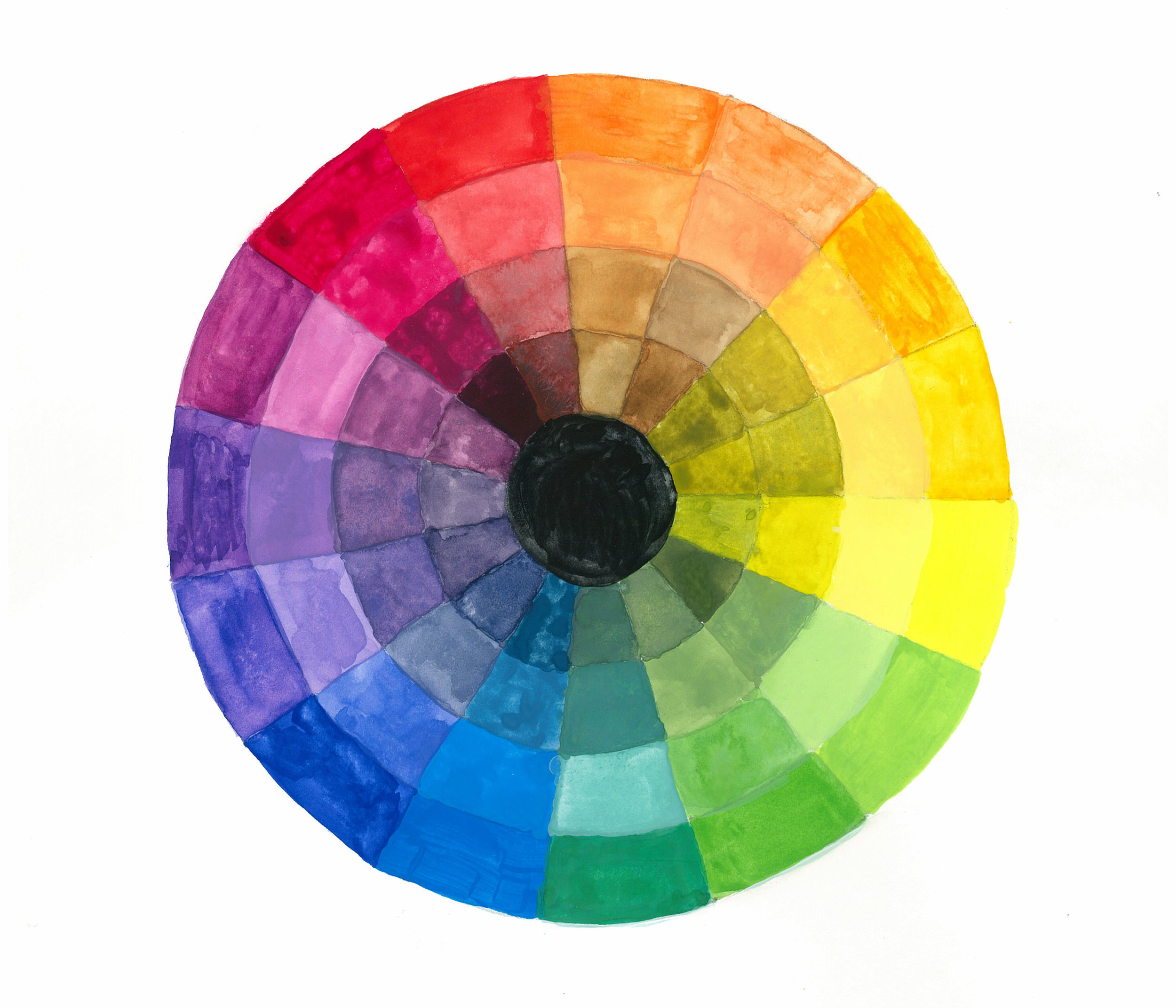
The Color Wheel organizes colors in a logical fashion based on the primary, secondary and tertiary hues. The primary hues are yellow, red and blue seating at twelve o’clock, four o’clock and eight o’clock. The secondary hues are a mixture of the primary colors and are orange, green and violet seating adjacent to the primary colors, followed by the tertiary hues of red-orange, yellow-orange, blue-green, blue-violet, and red-violet. The value of a hue can be altered by adding white, gray or black. When white is added to a hue it is called a tint. When gray is added to a hue it is called a tone. When black is added to a hue is it called a shade. The outermost ring of this color wheel is the pure hues of the color wheel. The receding layers are the tint, tone, and shade of the respective colors.

Value is the degree of lightness or darkness of a color in relation to white and black. The value of a color can be raised by adding white and lowered by adding black. Yellow is lighter in value than violet. Lightening a hue’s normal value by adding white creates a tint of that hue; darkening the hue’s normal value with black creates a shade of the hue. A normally high-value color, such as yellow, is capable of more shades than tints, while a low-value color, such as red, is able to have more tints than shades. The above chart demonstrates the value change of gray, yellow, orange, red, green, blue and violet. Some colors have a small color range such a yellow which becomes very light within two squares and loses its identity quickly as black is added. Whereas, strong colors such as red and blue retain their identity as they lower in value. Light values tend to be cheerful, middle values undemanding, and dark values somber.
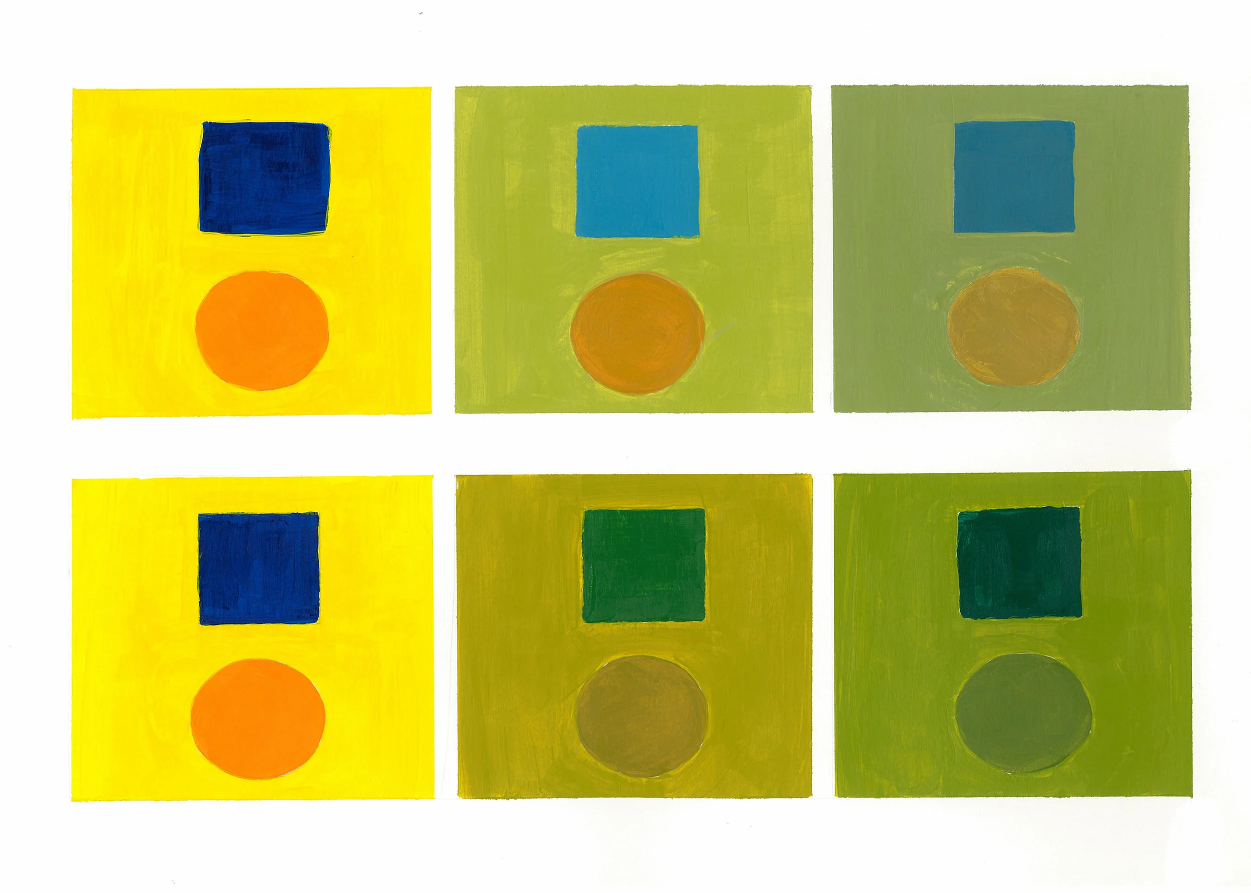
Intensity refers to the brightness of a color. A color is at full intensity when not mixed with black or white – a pure hue. You can change the intensity of a color, making it duller or more neutral by adding gray to the color. You can also change the intensity of the color by adding its complement. The blue and orange become duller and neutral when the gray is added along the top row. The intensity of the color along the bottom row changes when its complement (the blue with the orange and the orange with the blue) is added. Warm hues and high intensities are visually active and stimulating, while cool hues and low intensities are more subdued and relaxing.
Color Harmonies
The basic techniques for combining colors in the primary split color wheel are as follows:
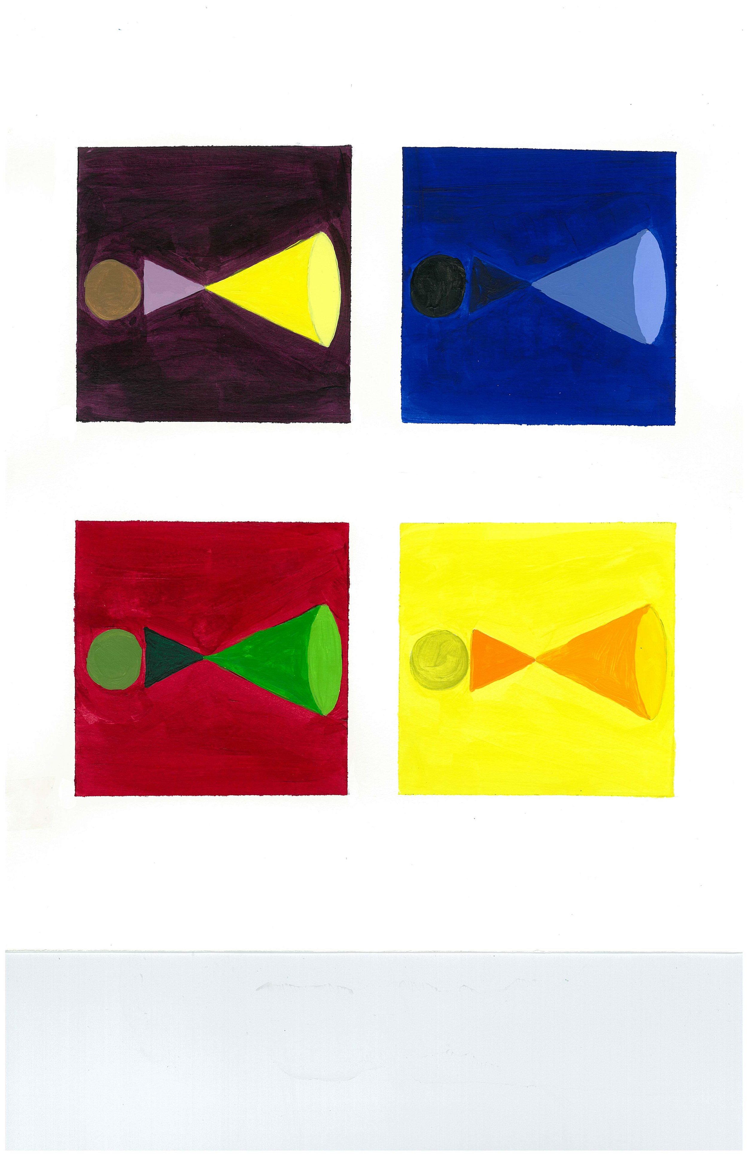
Monochromatic color schemes vary the value of a single hue. The hue can vary in value, and black or white may be added to create various shades or tints. This example is blue, which is a calming color.
Analogous color schemes use two or more hues from the same quarter of the color wheel. The hues may vary in value as this color schemes does with yellow-tone.
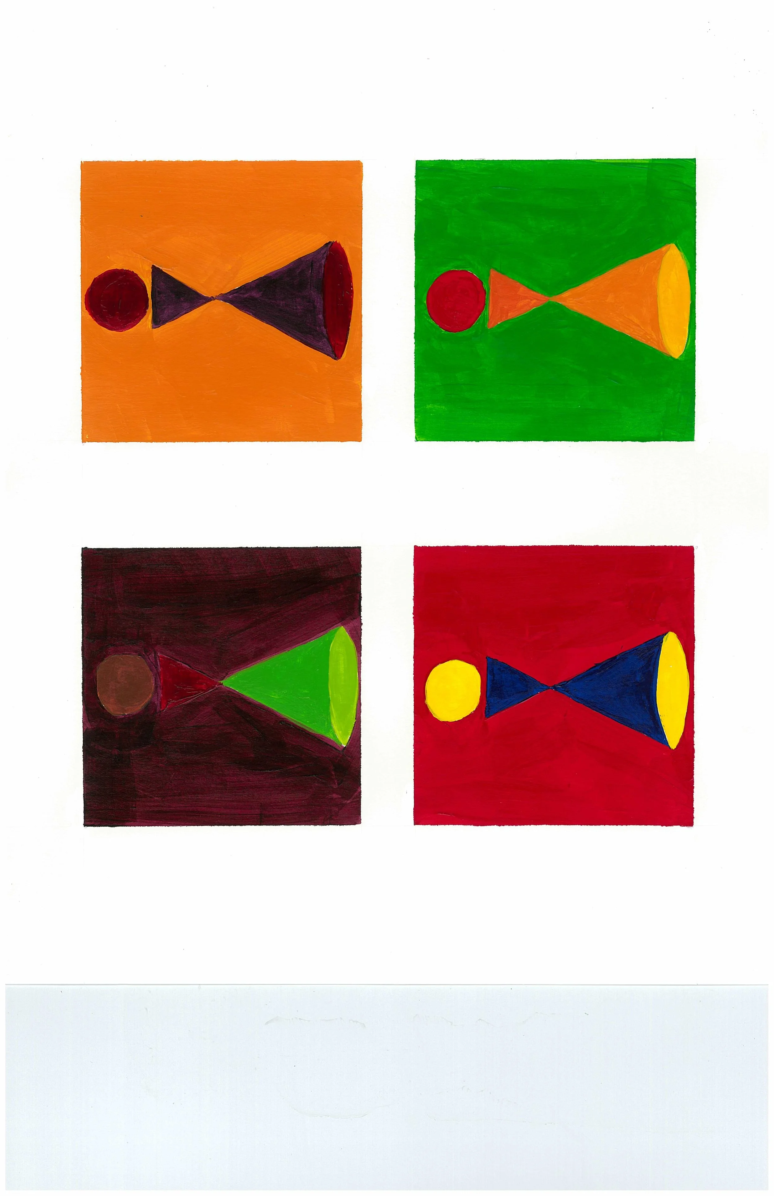
Complementary color schemes use the two hues on opposite sides of the color wheel, such as red and green, yellow and violet, or orange and blue. Complementary colors of yellow and violet in this example produce a very exciting, dynamic pattern.
Split Complementary color schemes combine one hue with the two hues adjacent to its complement. There are a total of twelve different combinations on the split color wheel. The combinations provide harmony.
Analogous Complementary color schemes combine three analogous colors with the complement of one of those colors. This example combines the four analogous colors of red, orange-red, orange, and orange-yellow with green, the complement of red. The analogous colors create dominance and the green enhances the effect by contrast.
Triadic color schemes use colors located at three equidistant points on the color wheel. This example is the basic triad with the primary colors of red, blue and yellow. It is considered bold and energetic.
Modified Triadic color schemes use three hues skipping over one color between each of the three hues on a twelve color wheel. This example is blue-violet, crimson and orange. The colors are nearly analogous and create harmony.
Tetrad colors schemes use two pairs of complementary colors forming a rectangle.
Monochromatic color palette of blue, blue-tint, blue-tone, blue-shade, and black.
Analogous color palette of yellow, yellow-orange, orange-yellow, orange, and yellow-tone.
Complementary color palette of yellow, violet, yellow-tint, violet-tint, and violet/yellow.
Split Complementary color palette of red, yellow-green, blue-green, yellow-green tint, and yellow-green tone.
Analogous Complementary color palette of red, orange-red, range, orange-yellow and green.
Triadic color palette of red, blue and yellow.
Modified Triadic color palette of violet, crimson, and orange.
Tetrad colors palette of red, green, violet, yellow-green, and green/red.
Interaction of Color
Simultaneous Contrast is the phenomenon which occurs when a color appears to change when seen against a different background.
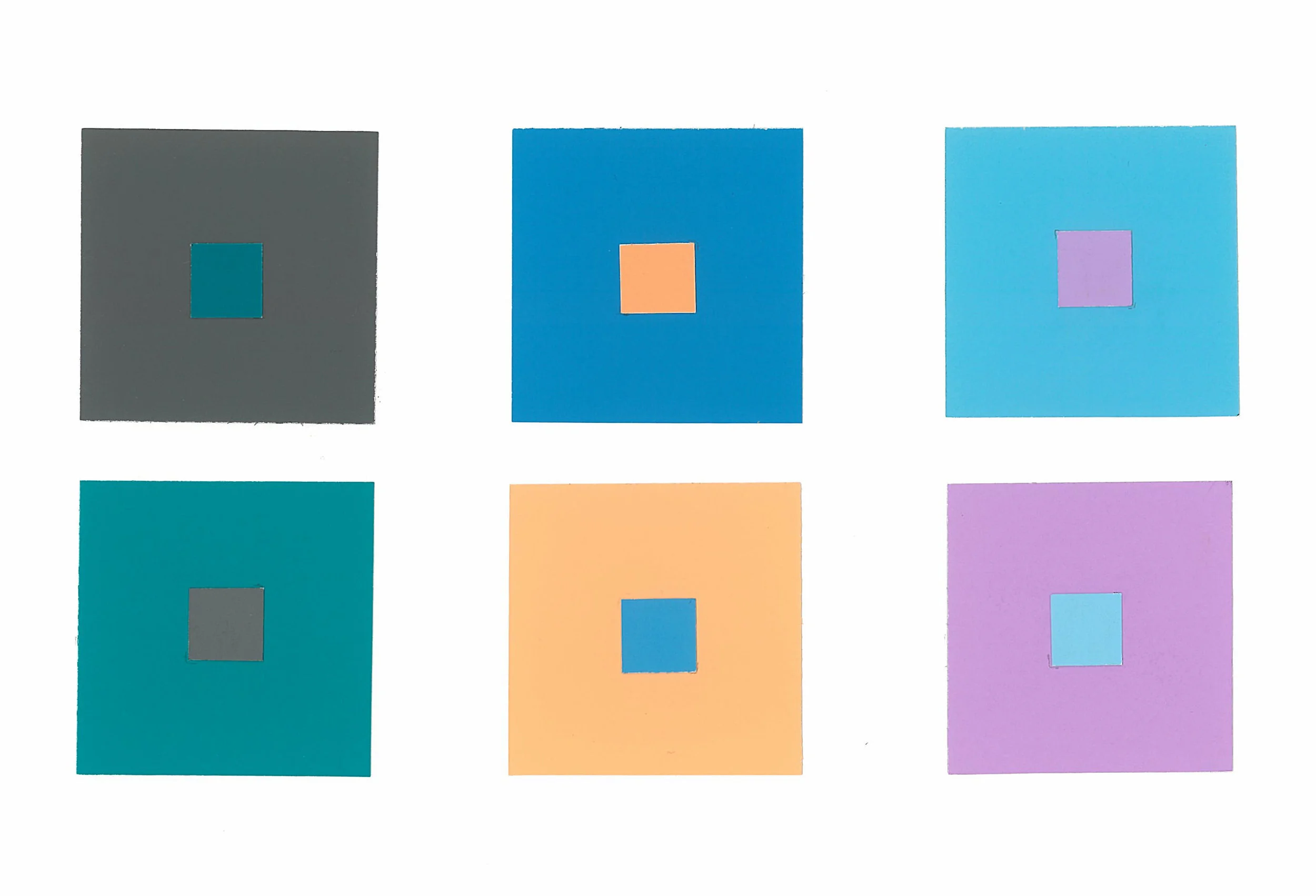
Two complementary colors placed side by side tend to heighten each other’s saturation and brilliance without apparent change in hue. When the two colors are not complementary, each will tint the other with its own complement and shift it toward that hue. Simultaneous contrast in hue is most easily perceived when two colors are fairly uniform in value. If one color is much lighter or darker than the other, the effects of contrasting values become more noticeable. Simultaneous contrast also affects the apparent value of color, which can be made to appear lighter or darker according to the value of its background colors. A light color will tend to deepen a dark color while a dark color will tend to brighten a light color.
One as Two
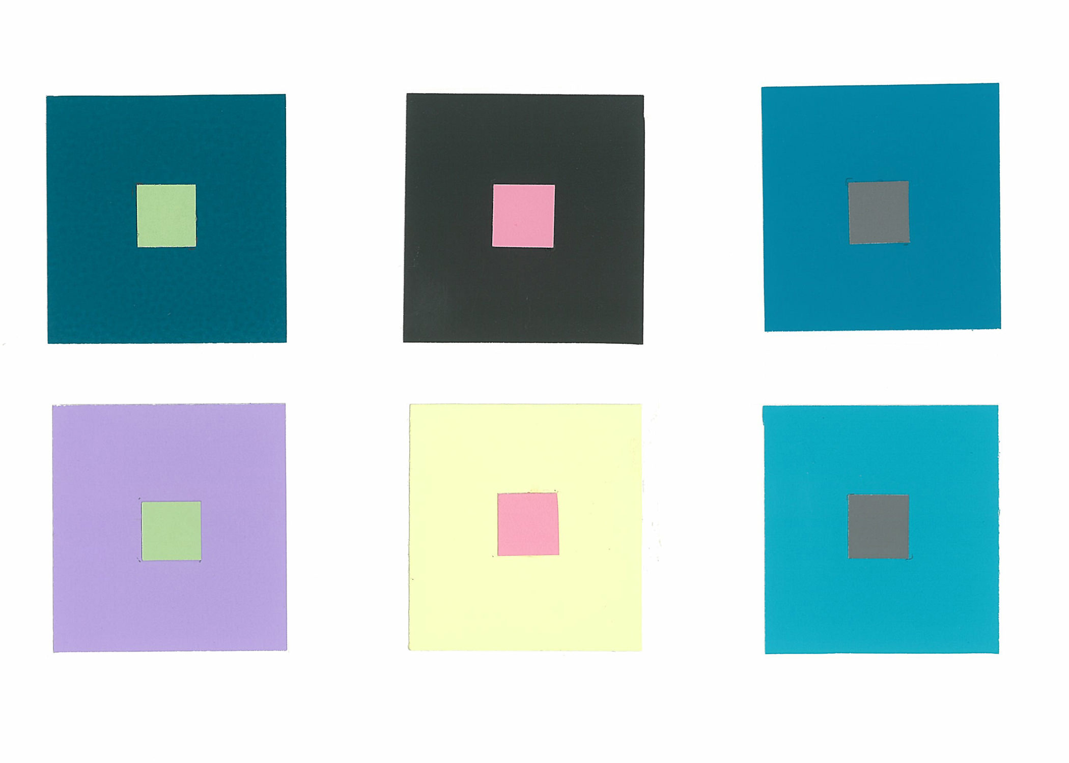
Two pieces of the color swatch and the same hue are made to appear different when placed on different grounds. For example, in the first row, the small green square is from the same green swatch. However when two squares are placed simultaneously together the green square on darker ground appears lighter and the green square on the lighter ground appears darker, even though it is the same color.
Two as One
Two pieces of different paper of different hues are made to appear the same when placed on different grounds. For example, in the first row, the small green squares are from different color swatches of different hues, yet they appear the similar. This is accomplished by the hue and intensity of the ground subtracting or adding to the squares appearance toward the qualities of opposite square.
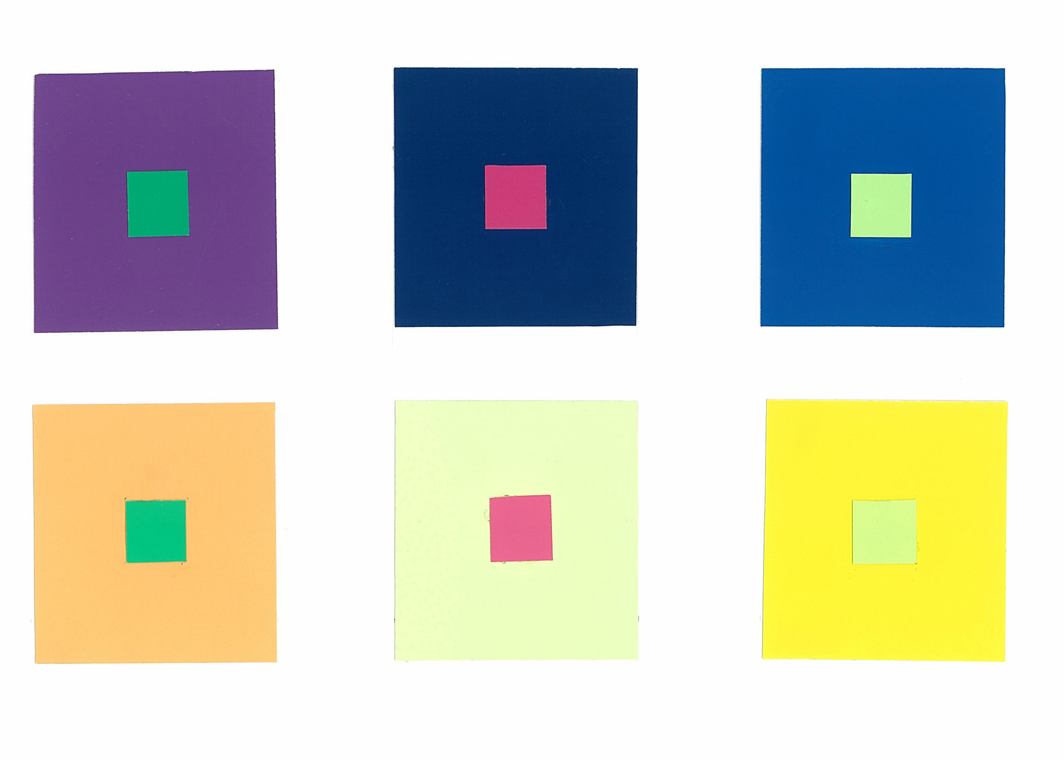
Four as Two
Four swatches of different hues are combined so that the ground of the top example is similar to the small square of the bottom example and the bottom ground is similar to the small square of the top example. The middle row is the more successful result because the selections are complementary colors of opposite hues and intensity and provide the greatest contrast.
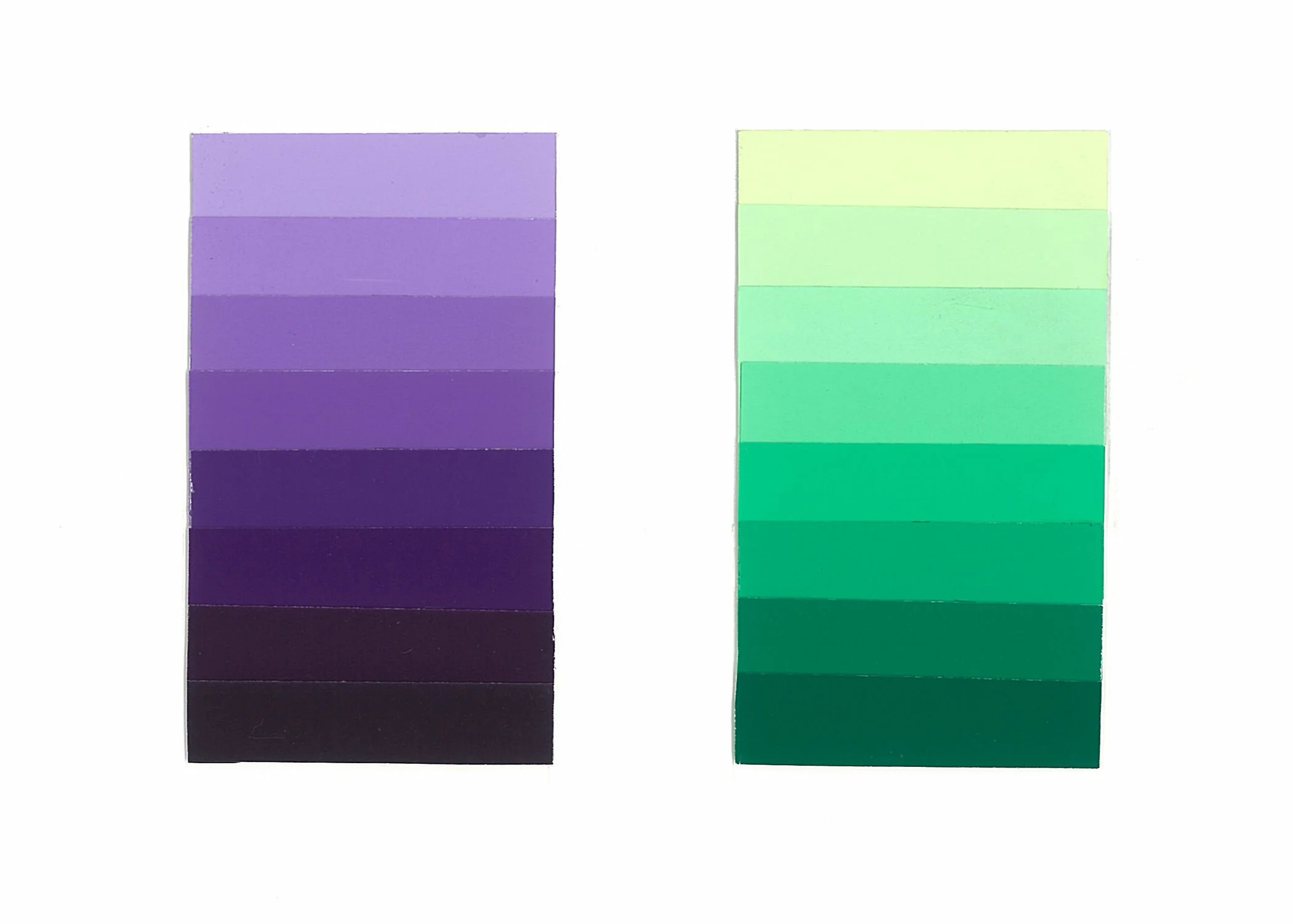
Fluting consists of selecting seven tints, tones, and shades of a particular hue and sorting them in the appropriate gradation of intensities from light to dark.
Does this helps you “see” all the nuances of color and how colors affect each other and ourselves? I hope so.
The images in this blog are the property of Kathleen Jennison, Interior Designer and are not to be used without prior approval by the artist.


Color Wheel Interior Design - Stellapagedesign.com
| 12 March 2016[…] color wheel interior design high quality picture id: 1012e | Credit […]
Zequek Estrada
| 9 July 2016It’s crazy that color can affect how we feel and how we behave. I think my mom said something about wanting a yellow kitchen because it’ll encourage people to eat or something like that. Interior designers must have loads to swatch cards since there are so many combinations of colors that could be made.
How to Style Your Home like an Interior Designer | KTJ Design Co
| 19 September 2017[…] Click here to read more about picking a color […]