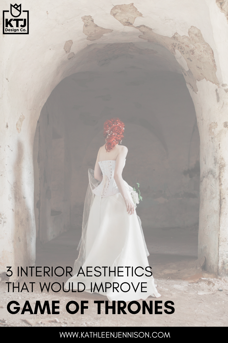
3 Interior Aesthetics that Would Improve Game of Thrones
Once upon a time, I was one of those people who hadn’t seen Games of Thrones. *gasp* When the final season came out, I decided it was time to join the band wagon and watch it.
I ordered HBO and binged watched all 8 seasons in one week. And, I have to say, I LOVED it.
When I watch any good television program (like Downton Abbey or The Crown), I am always intrigued by the sets they use as much as the plots themselves.
From day one of my Game of Thrones binge, I became acutely aware of the absence of color in their various sets. Byzantine times were, in fact, filled with color, and I can’t help think the White Walkers just went crazy from looking at all that white snow. After all, they snatched up newborn babies to turn their eyes a beautiful aqua blue – proof to me that they just craved some color!
I sometimes think I might turn into a White Walker if I look at one more white kitchen or one more white living room on Instagram.
If you follow some simple, basic rules of color harmony, you’ll easily find yourself living in your own TV set of glorious color – no White Walkers necessary.
Hop onto your dragon and head out your local hobby store to buy a color wheel.
How to Create a Room that Feels Vibrant
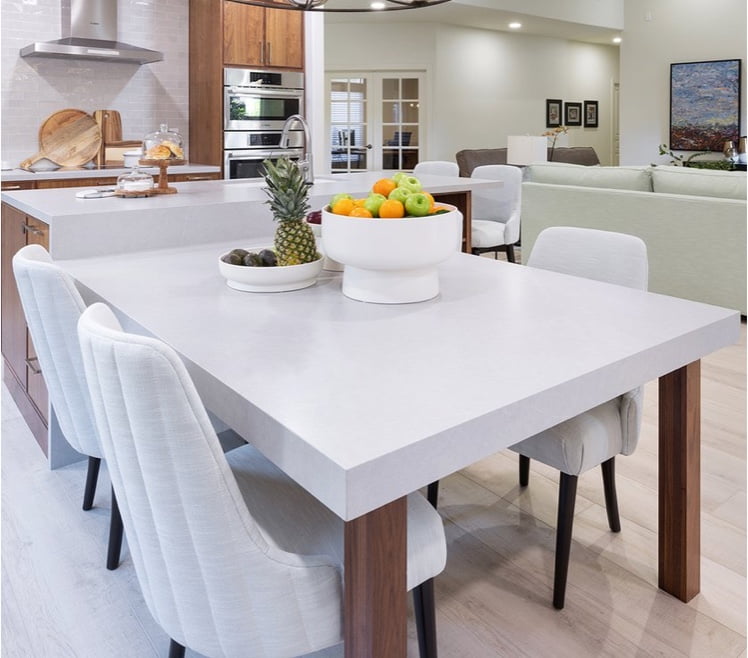
When you want your room to feel vibrant and full of energy, choose a complimentary color scheme. Complimentary colors are opposite each other on the color wheel and a blue and orange room is perfect.
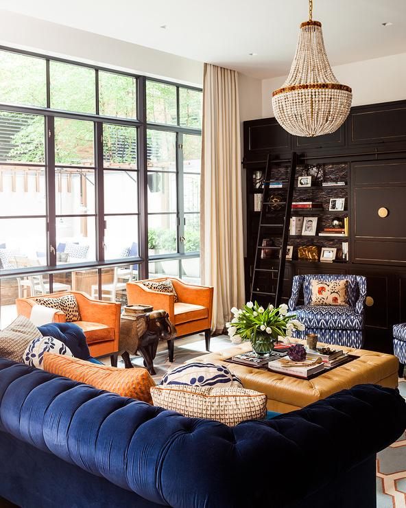
image // https://www.decorpad.com/
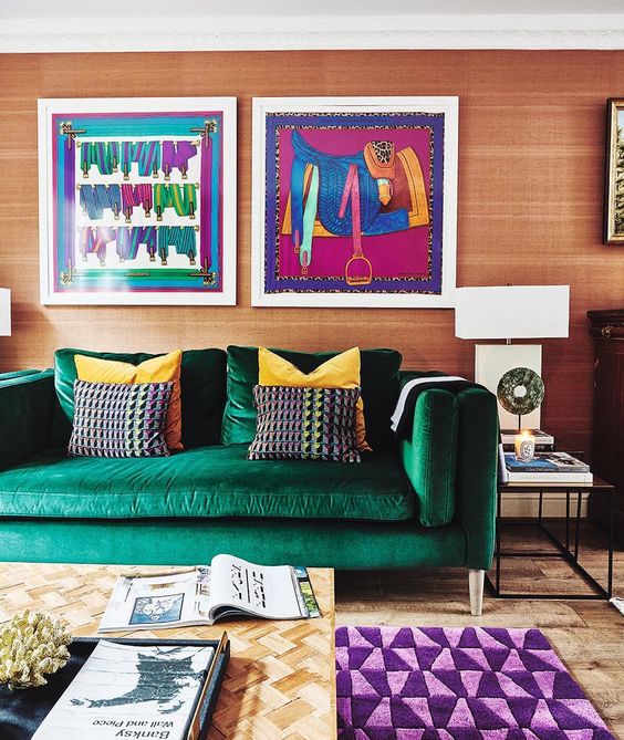
How to Create a Room that Feels Happy
When you want your room to feel happy and vivacious, chose a split complimentary color scheme. Split complimentary colors are one base color from your complimentary color and the two colors right next to the opposite complimentary color. For example, you might want green, purple and orange.
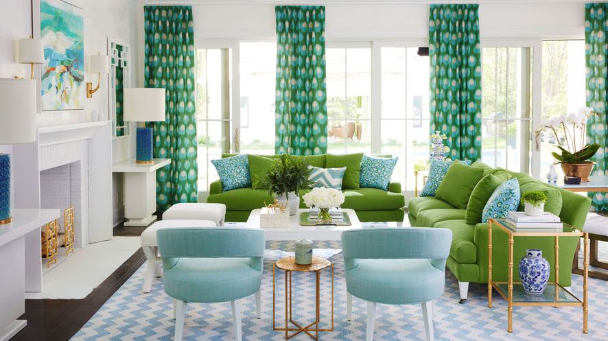
How to Create a Room that Feels Mellow
When you want your room to feel mellow and interesting, chose an analogous color scheme. Analogous colors are one base color from your complimentary colors and the two colors on each side of the base color. This analogous color room float effortless with beautiful tones of green, turquoise and celadon.
Ready to chat about Game of Thrones (or your interior design needs)?
Book a Discovery Call today (or send a black raven)!


Janet Lorusso
| 3 June 2019Haha – I’m one of the 3 people in the country that hasn’t seen (or read) Game of Thrones – though I do love The Crown and Downton Abby and the sets of those. Great tips and categorizations of color schemes!
Ann Porter {KitchAnn}
| 3 June 2019Add me to the list of people who hasn’t seen GoT.
I love the split complimentary room!!
We should make a group Pinterest board of all our favorite sets or scenes from film/television!